I've been playing with the idea of creating my own blog for a long time. I played with ghost a few years ago because I was some kind of Node.js enthusiast and wanted to try hosting this on my personal NAS. After I learned how easy it is to host a private page with Github I also tried Jekyll. With both approaches I felt uncomfortable creating my own theme. Additionally I wanted to use the whole blog project as something which I can build from scratch.
Because I haven’t brought my journey to an end the last times, I thought I can create pressure by starting the project with paying real money. So the first thing I did this time was purchasing the domain: jmeischner.com.
I wanted to host the blog with Github Pages so that I need a CNAME Record for my domain. I decided to manage my domain with Digital Ocean since I want to use it for another project in the near future and I like to have these things administrated in one place.
Design Phase
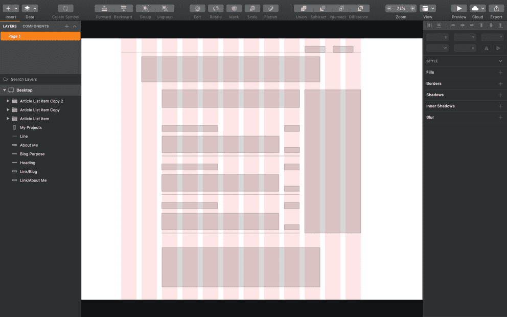
Also something new for me: I didn’t make the decision for the technology stack beforehand. I decided to go with the design first. I read a very inspiring article series from git-tower and after 2 years of absence from using Sketch I made an Udemy Course called Sketch from A to Z to refresh my Sketch knowledge.
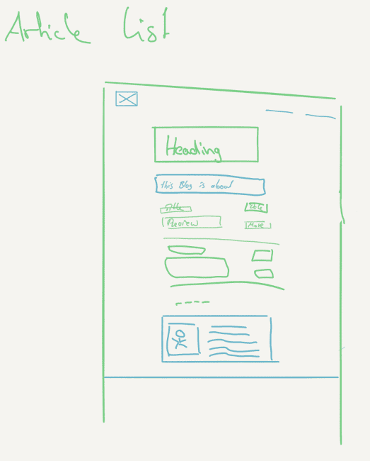
I finally started to create a rough design draft in paper.

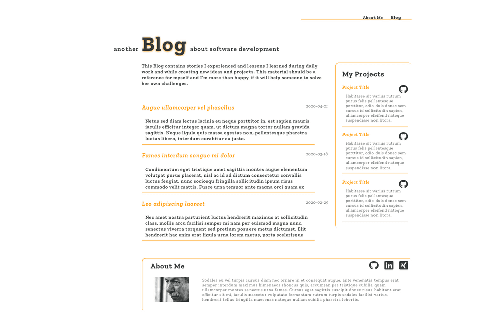
Thereafter I started to look for a font and colors I like. I ended up with Zilla Slab as serif font and Work Sans as sans serif font. To find matching colors I browsed colourlovers which is a bit cluttered with advertisement but has a huge amount of palettes and colors. A simple orange caught my eye as the highlighting color and I use a dark gray as primary text color.
So before I started the implementation I ended up with the following Sketch design.

Implementation Phase
I have used react at work and we have just started a new project with create-react-app so that I was curious to explore an alternative. I ended up with Gatsby. As a static page generator it integrates perfectly with Github Pages and with its built-in markdown transformation plugin it serves my need of having a markdown based blog system.
While working with Vue.js I got used to the single file components approach. Besides different other solutions I wanted to give the styled components idea a chance and started to create 2 basic Flexbox components to implement my design — Container and Item.
/** Container **/
import styled from 'styled-components'

const Container = styled.div`
  align-content: ${p => (p.alignContent ? p.alignContent : "stretch")};
  align-items: ${p => (p.alignItems ? p.alignItems : "stretch")};
  display: flex;
  flex-direction: ${p => (p.direction ? p.direction : "row")};
  flex-wrap: ${p => (p.wrap ? p.wrap : "nowrap")};
  justify-content: ${p => (p.justifyContent ? p.justifyContent : "flex-start")};
  width: 100%;
`
export default Container

/** Item **/
import styled from 'styled-components'

const Item = styled.div`
    flex: ${p => p.shrink ? p.shrink : 0} ${p => p.grow ? p.grow : 1} ${ p => p.basis ? p.basis : p.width ? p.width * 80 + 'px' : 'auto' };
    align-self: ${p => p.align ? p.align : 'auto'};

    @media (${p => p.theme.media.small}) {
        flex-basis: auto;
    }
`

export default Item
I used these components as base elements for most of the other styled-components const myComponent = styled(Container). To get the styled-component library working with the Gatsby production build it‘s necessary to use the gatsby-plugin-styled-components, otherwise there could be some strange effects that some styles do not apply or you can see the full page without styling for a short moment before the page renders correctly.
Additionally I created an overall theme with the global styling parameters I potentially want to play with in the future and which I want to reuse throughout my blog.
const theme = {
  fontFamily: "'Zilla Slab', serif",
  color: {
    primary: "#343838",
    secondary: "#FF9900",
  },
  zilla: {
    light: 300,
    regular: 400,
    semibold: 600,
    bold: 700
  },
  fontSize: {
    h1: "24px",
    h2: "22px",
    h3: "20px",
    m: "18px",
    s: "16px",
    sm: "14px",
    xsm: "12px"
  },
  media: {
    small: "max-width: 576px",
    medium: "max-width: 768px",
    large: "max-width: 992px",
  }
}

export default theme
The next big step was to setup the markdown transformer. Fortunately this is one of the basic features Gatsby ships with, so that I could follow the intermediate tutorial starting from the transformer plugins chapter. As described there I started with filling my article list page, which is an overview about the existing posts. Thereupon I followed the chapter programmatically create pages from data to create the actual blog post page from a markdown document.
For the blog post page I additionally added gatsby-remark-vscode which I wanted to use to display containers with syntax highlighting in my blog posts. To get this plugin working with a smaller viewport width I needed a weird css quirk:
.grvsc-line {
  width: 0;
}

.grvsc-code {
  min-width: 0;
}
Finally I struggled a bit with a tool to write the actual blog posts. I am a big fan of bear and as far as I made all notes concerning this current story in bear I started to write the text there also. I found the markdown export functionality not sufficient enough, so that I tried Ulysses again after some years. Unfortunately the export didn‘t fit my needs again and more pivotal was, that I had serious problems with the iCloud sync. I am now writing these sentences in bear and will try to build a custom workaround for the frontmatter part of the document.
Thank you for reading so far and I‘m glad that I have finished my first blog post now.
Link Collection
- Article series with hints how to build an own blog
- Managing a custom domain for a Github pages site
- All around colors
